Topsheet app and website redesign
Role UX/UI Design
Team Pailin Chantravutikorn and Ashley Chang
Platform Native app and web (mweb + desktop)
Tools Figma, Adobe Illustrator, Photoshop, Google Suites (sheets, slides, docs), Trello, Miro, Pen & Paper
Client Overview
Topsheet is an entertainment payroll technology that manages onboarding, time cards, payroll, and direct deposit paychecks.
The Challenge
Topsheet’s onboarding, payroll processes, and overall user flow can be confusing and tedious. How might we help Topsheet optimize their user flows and enhance their user’s experience while improving the overall “delight” to generate more revenue for the business?
The Process
The Solution
By using UX design methodologies, our objective is to revamp the native app experience and craft a user-friendly desktop website experience, aiming to enhance operational efficiency and transform a traditionally cumbersome process into a delightful experience. Our goal is to foster stronger client partnerships and drive increased sales through an elevated user experience.
Research & Discover
Learning About the Business
To gain a deeper understanding of Topsheet’s platform, we conducted interview sessions with Topsheet’s employees and key stakeholders.
“Our primary objectives during this phase was to understand Topsheet’s business, users, system, problems and goals.”
What we learned
Topsheet specializes in streamlining production management but faces a significant learning curve issue.
During the COVID-19 pandemic, Topsheet is proactively striving to ensure customer satisfaction, positioning themselves for industry leadership when projects resume.
Topsheet acknowledges areas in their workflow that need optimization for both producers and crew/cast and foresees the industry embracing digital solutions, accelerated by COVID-19 induced trends.
Identifying Key Issues
To identify critical issues, we conducted a heuristic evaluation based on Jakob Nielsen's 10 usability principles. We thoroughly explored the website and mobile app, simulating user tasks from start to finish. This immersive approach allowed us to gain a comprehensive understanding of the current system and revealed significant usability challenges, primarily related to efficiency and learnability.
Understanding
Competitors
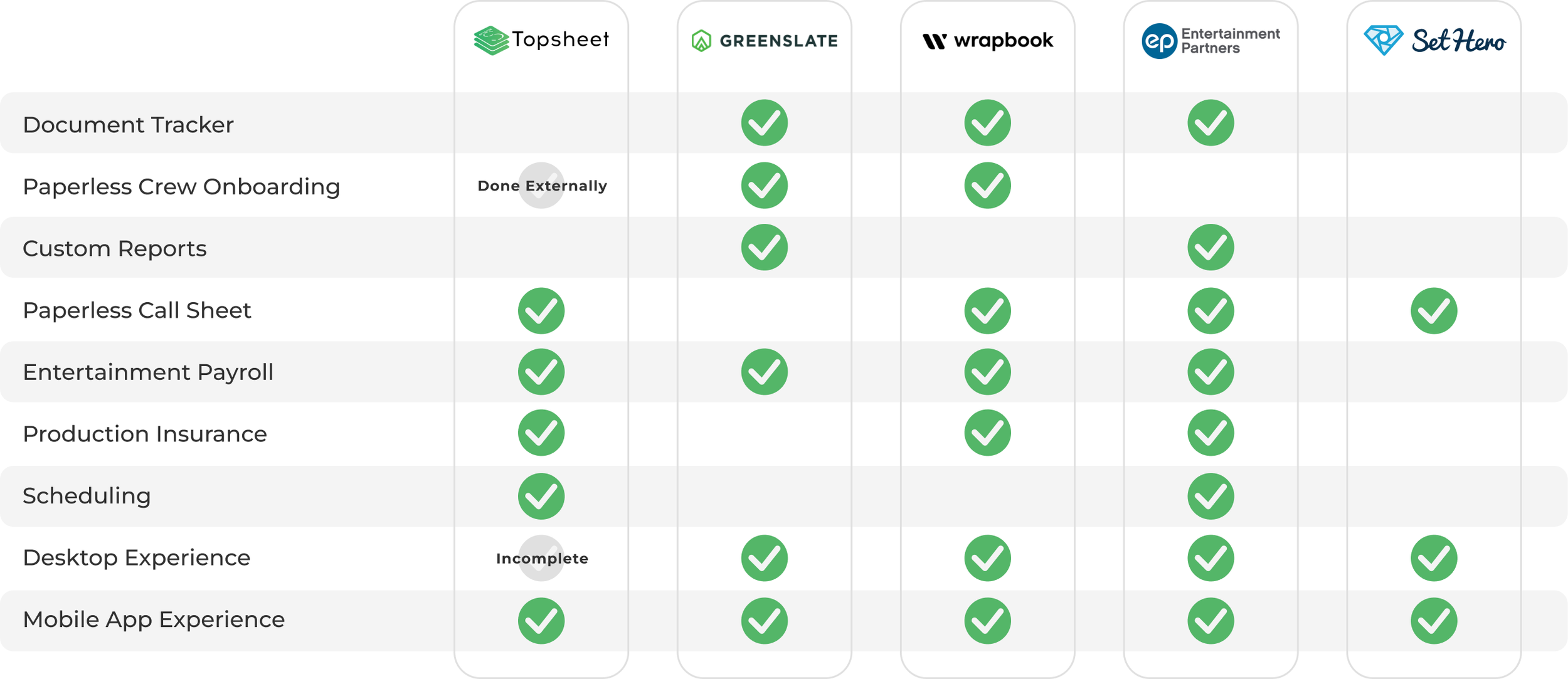
Conducting a competitive analysis proved instrumental in deepening our understanding of the entertainment market, Topsheet's product, and its overarching goals. By delving into the competitive landscape, we unearthed actionable insights that shed light on what sets Topsheet apart and where opportunities lie.
Explore detailed competitive comparative analysis
KEY TAKEAWAYS
Topsheet's unique selling proposition as an all-in-one production management service distinguishes it in a market where such comprehensive solutions are scarce.
The need for a document tracker for streamlined employee onboarding.
Demand for customizable reports, especially given the industry's payroll nature, aligning with the offering of other payroll companies.
The imperative of a desktop user experience, as this was a standard among competitors, highlighting the need for Topsheet to provide a comparable offering.
User Interviews
Conducted 15 user interviews involving both administrators (responsible for creating payroll projects) and crew/cast members, encompassing those experienced with Topsheet and newcomers. The interviews covered topics like payroll, timecards, and callsheets for administrators, while crew members discussed signing timecards and payment processes.
During these sessions, we assigned specific usability tasks, aligning with typical user goals on the platform. This approach allowed us to not only validate existing heuristic violations but also uncover fresh insights and pain points.
uncovering key insights
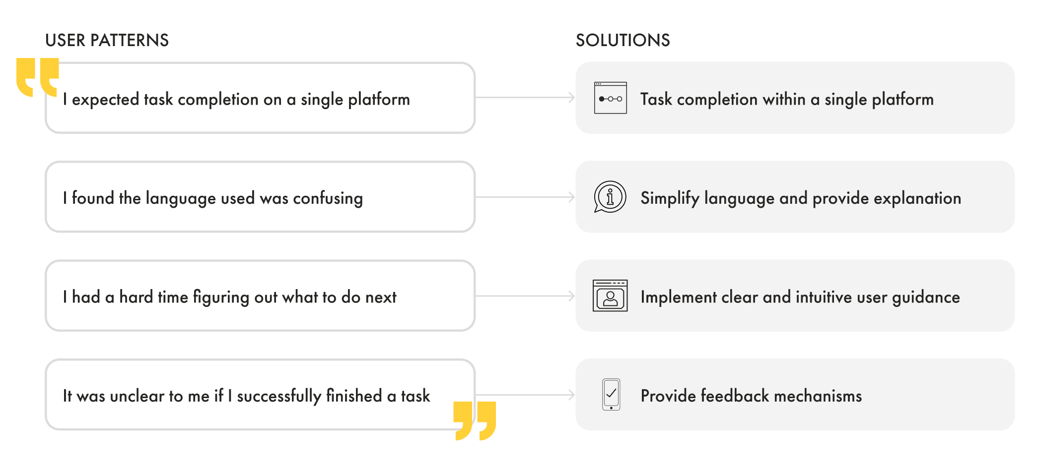
Our journey involved a pivotal phase of affinity mapping. Through collaborative sessions and user feedback, we meticulously gathered a wealth of insights, aiming to distill complexities into clear, actionable improvements.
It was enlightening to witness common threads weaving through user experiences, highlighting both challenges and opportunities. From users expressing frustration with external task dependencies to subtle nuances in language comprehension, the affinity mapping sessions unveiled the nuanced landscape of user sentiments.
These insights not only fueled our design decisions but also served as a compass for prioritization. By distilling user perspectives into actionable themes, we could strategically address pain points and amplify positive experiences.
USER PERSONAS
Leveraging insights gathered from our user interviews, we used affinity mapping to distill key findings and user behavior patterns. These observations served as the foundation for the development of two distinct user personas: one for administrators and another for crew/cast members.
In addition to the user personas, we also identified specific user flows, each with its unique characteristics. Our research, which combined competitive analysis insights and user feedback, unveiled a notable need for a desktop experience, particularly for administrators dealing with document-heavy workflows. This revelation prompted us to advocate for a comprehensive desktop solution, as the current website dashboard only offered the "inviting cast/crew" flow. Our client recognized the significance of this insight and acknowledged the importance of implementing a desktop experience.
Problem Statement - administrator
Juliet is grappling with the implications of the AB5 law, which no longer permits her to hire independent contractors for her production business. She is seeking an affordable solution that not only ensures compliance but also provides clear guidance on payroll management, production insurance, and efficient crew coordination.
“How might we empower Juliet by providing her with comprehensive information, step-by-step guidance, and an affordable solution for managing payroll, securing production insurance, and facilitating the seamless upload of necessary forms to streamline her production operations?”
Problem Statement - crew
Shane finds himself bewildered by the requirement to download an app, complete tax documents, and sign timecards. His primary concern is receiving timely payments, but these new steps have left him feeling unsure and in need of guidance.
“How might we clarify the significance of timely tax document submission to Shane and provide him with straightforward guidance on accessing call sheets and signing timecards, ensuring he can promptly receive his payments?”
Ideate & Design
narrowing our focus
Using insights from evaluations, mapping, and interviews, we identified user challenges. With a list of issues, we formulated features to address them. I led a stakeholder exercise using the Moscow diagram, categorizing features for prioritization based on business requirements and user needs. This method, categorizing features into Must-haves, Should-haves, Could-haves, and Won't-haves, proved pivotal in aligning diverse perspectives and synchronizing project objectives with user needs.
Key prioritized features
Project creation via web
Calendar redesign
Revisit “projects” navigation
“To-do” list feature
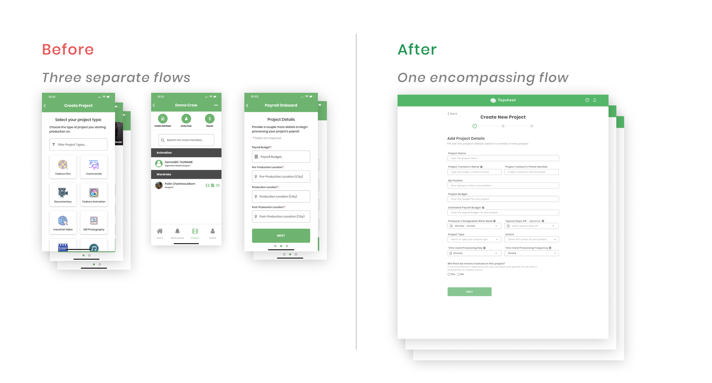
Combine “Project creation” and “Joining payroll” sections
Ideation through sketches
We translated our initial concepts and insights from research into tangible sketches. During remote design sessions, we allocated 10 minutes to rapidly sketch multiple iterations. Subsequently, we shared our concepts through Slack for discussion, highlighting the most favorable elements of each sketch. This collaborative process led to the consensus on a low-fidelity wireframe.
Collaborative Refinement
The collaboration extended beyond traditional brainstorming sessions. Utilizing Slack as a communication hub, we seamlessly shared our sketches, fostering an environment where each team member could express their thoughts and preferences. This collaborative exchange enabled us to distill the best elements from each sketch, paving the way for the creation of a cohesive low-fidelity wireframe.
Test & Iterate
Navigating 21 Usability Tests
Throughout the project, our design evolution was driven by insights gained from a comprehensive series of 21 moderated usability tests. Our iterative process took us from the initial low-fidelity wireframes, through intermediary mid-fidelity iterations, culminating in the creation of high-fidelity wireframes. These tests not only shaped our designs but also validated our user-centered approach at every stage of development.
Hi-fidelity wireframes
home screen
key improvements
Streamlined Navigation and Findability: Replaced the full-screen calendar view with an intuitive dashboard, featuring key navigation elements like active projects and tasks. Addressed previous navigation and accessibility issues, prioritizing a comprehensive project date overview over concealing essential tasks.
Task List: Introduced a "task list" directly addressing the common challenge users faced in determining their next steps. This enhancement was inspired by insights gained from competitive analysis and direct user feedback.
Restructured Time Cards and Call Sheets: The presentation of time cards and call sheets was reorganized, transitioning from a daily basis to a more intuitive project-based approach. This strategic shift significantly improved the findability of critical information, turning the home page into a comprehensive "overview" in alignment with users' preferences.
Addition of "Active Projects" Section: In response to user research indicating a preference for working on a project-centric basis, we introduced a dedicated "Active Projects" section. This addition ensures users have quick and direct access to project-related information, supporting their workflow on a project-by-project basis.
Project screen
key improvements
Unifying Project Features: The transformation in navigation is prominently showcased on the project page. In the prior version, clicking into a project only revealed a crew list, leaving essential features such as call sheets, time cards, and tax documents scattered across the application. Users encountered significant challenges in locating these crucial tools, which hindered their ability to complete simple tasks and manage payroll efficiently.
Project-Centric Preferences: Our user research illuminated a key insight: users preferred working on a project-centric basis, with an expectation that all relevant features would be readily available within the project context when they clicked into it.
project and payroll onboarding flow
key improvements
Unified Onboarding Processes: We streamlined and unified the processes for project creation and payroll creation, aligning with Topsheet's aim to integrate these seamlessly.
Enhanced Communication Flow: As part of this integration, we introduced new features that allowed users to upload forms and tax documents within the flow. This not only improved efficiency but also significantly reduced the need for back-and-forth communication between Topsheet and the user.
call sheet screen
key improvements
Clear Text Hierarchy: Implemented a clear text hierarchy using block elements, departing from the previous grid-like structure. This change enhances readability and user comprehension.
Reducing confusion and clutter: We replaced the button resembling a "live chat" feature, initially used for "notifications," with a dedicated section within the call sheet, streamlining the interface.
Conventional "Schedule" View: The redesign focused on delivering a more conventional and standardized "schedule" view, contributing to an overall enhanced user experience. This simplification aligns with user expectations and preferences.
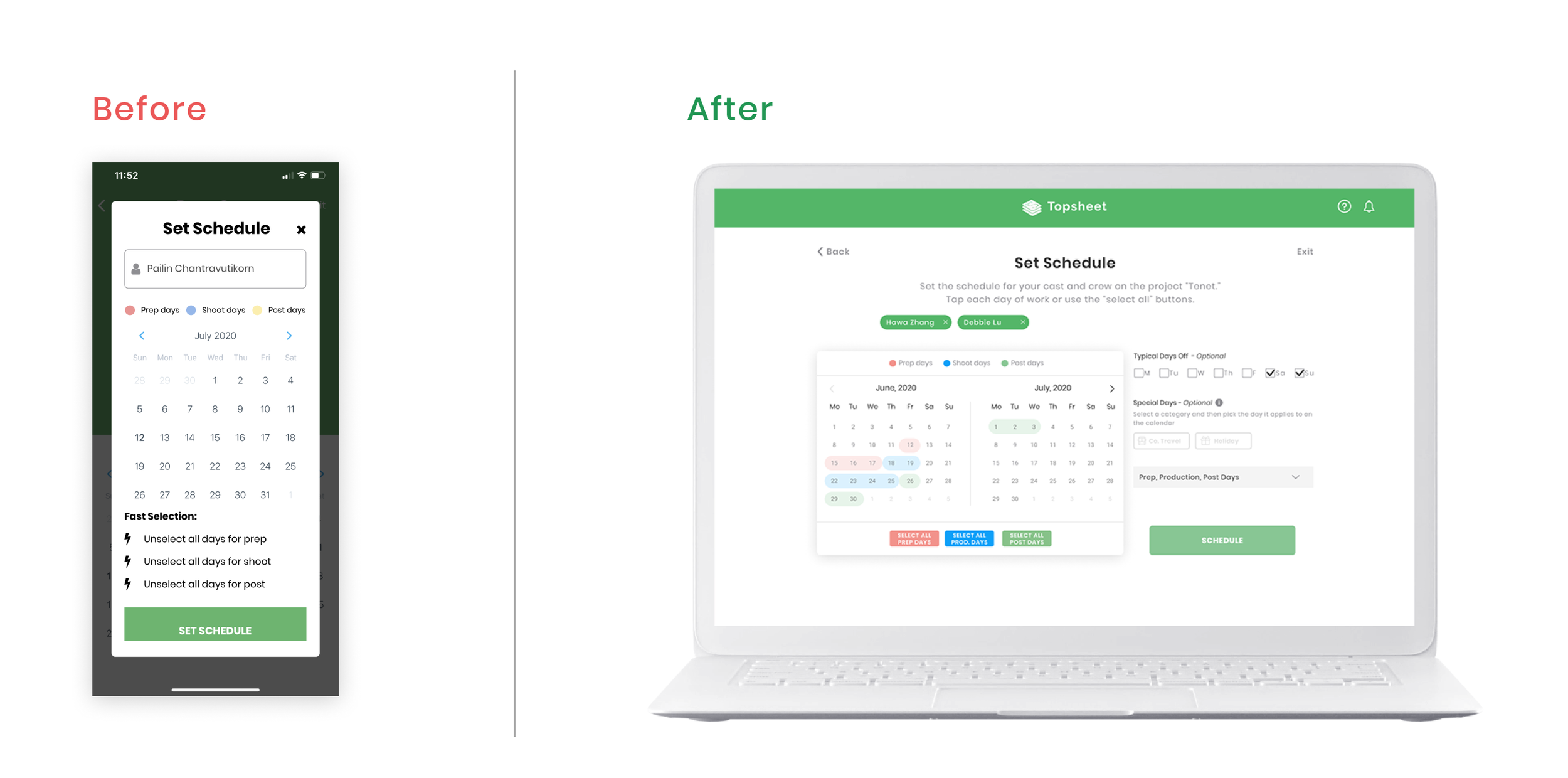
Scheduling
key improvements
Enhanced Calendar Highlighting: Implemented a light color highlight on the calendar to help users easily recall previously inputted prep, shoot, and post days.
Improved "Fast Select" Visibility: Added prominent buttons around the "fast select" options and introduced color variations for better comprehension, addressing user confusion.
Dual Calendar Display: Introduced the display of two calendars on the desktop version to accommodate users' desire for a wider view, especially beneficial for longer production schedules.
Multi-Person and Department Scheduling: Provided users with the freedom to create new set days for individuals or departments, enhancing customization and adaptability.
Timecards
Key improvements
Centralized Timecard Management: Introduced a dedicated space within each project for all timecards, allowing administrators to easily access and review timecards spanning multiple days.
Streamlined Approval Process: Implemented functionalities for admins to view all incomplete and ready-to-approve timecards in one location, reducing the time and effort required for payroll processing.
Enhanced Search and Filtering: Incorporated robust search and filtering features to enable administrators to efficiently locate specific timecards, improving overall navigation and usability of the payroll system.
In Retrospect
Next Steps
Sustained Research, Iteration, and Testing: As we navigate the diverse landscape of Topsheet's user base and industry, a continuous refinement process will allow us to adapt to evolving needs. Embracing the idea that design is an ever-evolving journey, future research should delve deeper into emerging use cases, ensuring our solutions remain aligned with the dynamic expectations of Topsheet's users.
Foster Parity Across Mobile and Desktop: Users have indicated a preference for accessing Topsheet's functionalities from various devices, highlighting the need for a consistent and coherent experience. By focusing on feature parity, we can ensure that users seamlessly transition between platforms, fostering an intuitive and unified interaction that enhances overall usability and user satisfaction.
What I learned
In retrospect, the journey with Topsheet was more than a design project; it was a collaborative exploration into the intricacies of the entertainment payroll ecosystem. The combination of research, ideation, and iterative testing not only transformed user flows but also elevated the overall delight of interacting with the Topsheet platform.
The realization that a user-friendly experience is not just a goal but a continuous evolution has left an indelible mark on our approach as UX designers. As we look back, we carry forward the lessons learned from Topsheet, reminding us that true success lies in designing experiences that not only meet but exceed the diverse expectations of users, ultimately fostering stronger client partnerships and driving business growth.


